Full Infographic here

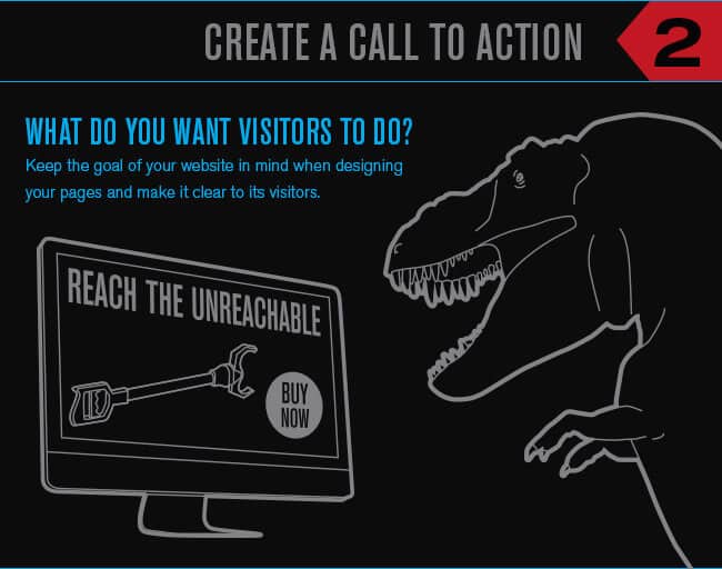
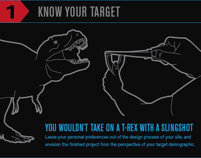
In today’s technology driven world, most consumers either prefer to purchase products exclusively online, or look to a company’s website to see if their storefront is worth visiting. This means that no matter how beautiful your location is, you’ll still be overlooked by many consumers if you don’t have the website to match. This is why the designers at Red Olive have created a list of the top five elements of web design to help you convert your site’s viewers to clients of your business. Look to the list below to start steering your online traffic in the right direction!Know your TargetT-Rex has a problem. There are just so many things he would like to do but his arms are far too short. Picking up stuff without having to bend over and shredding it with his teeth, scratching his head without having to lay down and use his back legs, pushing elevator buttons without having to get awkwardly close to the wall, etc. A better idea than hunting a T-Rex would be to sell him arm extensions. Knowing and understanding the desires of your target audience and tailoring your site directly to them will help you be sure that you have created a display that is appealing to them. Leave your personal preferences out of the design process of your site, and envision the finished project from the perspective of your targeted demographic. Even small attributes can change the mood of your site’s viewers so significantly that they may choose not to do business with your company. In the end, it is really their opinion that counts.Creating a Great Call to ActionKeep the goal of your website in mind when designing your pages and make it clear to its visitors.  If customers aren’t sure of where to go or what to do on your site, they’ll go to one that tells them! By creating a call to action, you give customers clear directions that guide them throughout the process of accomplishing what they came to your site to do. If your online objective is to sell products, create a clean design that highlights your selection and make the purchase page easily accessible from any location on your site. If you would prefer that your customers contact you for more information, make sure that you have current and accessible means of contact listed on every page of your site in an easy to find location and legible format. No matter what the main objective of your online presence is, it needs to be clear and easy to follow on your website to achieve it.
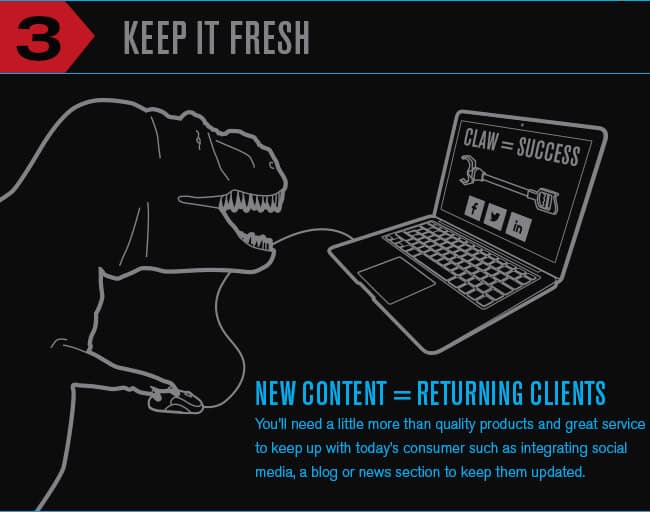
Keep Your Content FreshReturning clients help a business thrive, but you’ll need a little more than quality products and great service to keep up with today’s consumer. An effective method of driving customers back to your business is keeping an updated site that gets them involved. Incorporating a blog and social media integration in the design of your site is a great way to achieve this because you will be able to maintain consistent contact with them after their initial purchase. It is important however, to note that simply having these forms of interaction on your site isn’t enough. You need to keep them updated and interesting in order to find an increase in returning visitors.
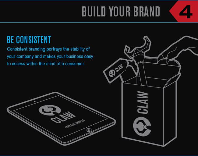
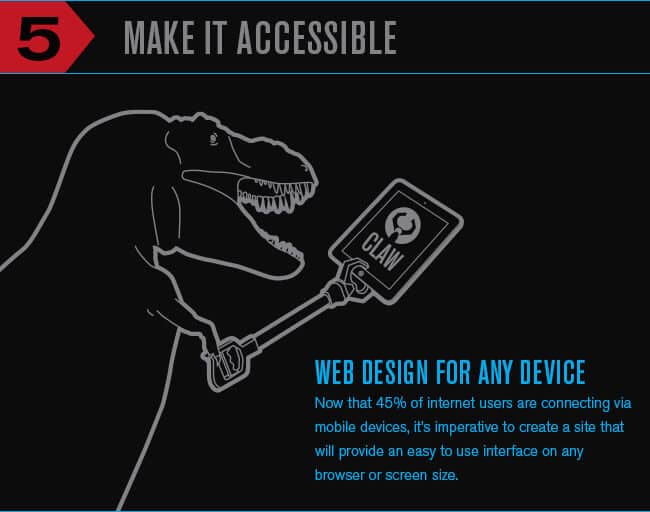
Build Your Brand with ConsistencyConsistent branding portrays the stability of your company and makes your business easy to access within the mind of a consumer. If you’re constantly changing your colors or design from page to page, viewers will get lost and lose interest. Keep a consistent and clean design throughout your site, and include your logo to create a visual association for your brand. By doing this, you will not only make your company more memorable and easy to find for consumers, but will also create a more polished and professional appearance.Make it Adaptive to All Devices with Responsive DesignWhen you consider that 45% (and growing) of internet users are now connecting via mobile devices, you see the major importance of creating a site that will provide an easy to follow display on any browser or screen size.  Designing a responsive or mobile version of your site will give its viewers a simple and clean layout no matter what they browse from without the pain of swiping through a zoomed in version. The easier it is to view your site’s content, the more likely they are to read on and see what you have to offer. Encourage viewers to educate themselves about what you can do for them by creating a source of information that they can access easily.

Although there are many aspects of creating a great site that gets the results you want, these top five elements provide you with a great start for your design.  Building a site that portrays the right image of your company and provides a simple source for important information is crucial to your success.  The team here at Red Olive realizes this, and keeps up on all of the new trends in design to make sure that our clients have the most impressive sites possible. Call us today at 866-RED-OLIVE (866-733-6548) or Contact Us to start building the site your company needs to succeed.

Full Infographic

Back to Top

To embed this infographic into your site please use this code:

<a href=”http://www.redolive.com/utah-web-designers-blog/2013/04/01/the-top-five-elements-of-web-design/#Full-Infographic”><img src=”https://www.redolive.com/assets/uploads/2013/04/The-Top-5-Elements-of-Web-Design-Infographic.png”></a>
Top 5 Elements of Web Design Infographic

One Comment

  • Ben Peck says:

    Love it guys. The more clients understand this the better. I would encourage doing user testing. Test often to know what’s working and whats not.

    A lot of times, people don’t know what they want until you show it to them.
    – Steve Jobs